There are 43 different choices in the drop-down menu for "compose".
What do all these different choices do?
Unless you understand the technical explanations provided by IM, you pretty much just have to try them to find out. With 43 different options to go through, that's a lot of time wasted looking for a nice effect. Many of the choices render nearly identical effects, others give you an output no different from your original background image.
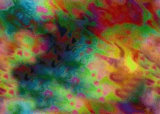
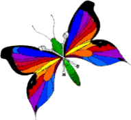
So, I have tried out each option available, using the two images below. Your results will of course differ depending on the colors in your images, but the following pages of examples will at least give you an idea of what each choice does, and help you eliminate the ones that don't do much of anything.
I organized the examples by appearence, grouping results that appeared similiar together. You can click on the thumbnail images to see the actual result image full-size. For those of you who actually understand the technical explanations provided by IM, you can click on the name under the thumbnail to read IM's explanation of that effect.
| "target" or "destination" image
Input when you first enter IM. |
"composite" or "source" image
|
~ Col's Collection Home ~